The Analytics section helps you understand how your campaigns are performing. It shows key metrics such as impressions, clicks, conversions, and spend — all in one place.
You can view performance data from the Analytics tab in the left-hand panel or within an event’s workspace.
Metrics Overview
The Analytics section includes several groups of metrics that describe different aspects of campaign performance.
Reach metrics
- Impressions — number of times your ads were displayed.
- Reach — number of unique users who saw your ads.
- Frequency — average number of times each user saw your ads.
Engagement metrics
- Clicks — number of times users clicked on your ads.
- Likes — number of likes your ads received.
- Comments — number of comments left on your ads.
- Follows — number of new followers gained as a result of ad interactions.
Conversion metrics
- Landing page visits — number of times your landing page was opened after ad clicks.
- Conversions — number of users who completed the key action.
Cost metrics
- Spend — total amount spent on ads.
- CTR — click-through rate, calculated as the ratio of clicks to impressions.
- CPM — average cost per 1,000 impressions.
- CPC — average cost per click.
Together, these metrics provide a complete picture of campaign performance, covering reach, engagement, conversions, and budget efficiency.
Report Settings
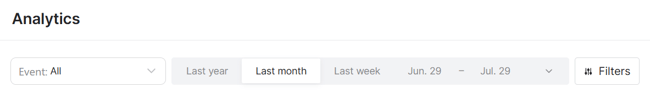
You can tailor the analytics view using several controls:
- Event scope – Use the dropdown at the top of the page to view data across all events or focus on a specific one.
- Date range – Select a time period such as Last week, Last month, Last year, or define a custom range.
- Granularity – Choose how data is grouped over time: by day, month, or year.
- Filters – Refine your view using filters for specific campaigns or landing pages. Click Reset to remove all filters and return to the default view.
Interactive chart
The chart helps you track how different metrics change over time. Metrics are grouped into three categories:
- Countable – raw totals such as impressions, clicks, or conversions
- Percent – ratio-based values such as CTR
- Money – cost-related metrics including spend, CPM, or CPC
- Ratio – metrics that describe proportional or averaged relationships between values
You can select several metrics for each vertical axis, but all of them must belong to the same category to ensure a consistent scale. Each axis is configured independently, so both sides can use metrics from the same or different groups. For example, you might display Impressions, Clicks, and Conversions on the left, and Spend on the right to compare engagement and cost side by side.
If you're working with financial metrics, you can also change the display currency using the dropdown next to the axes.

Event table
Below the chart, you'll find a table that displays performance metrics for each item in the current view. Each row represents a separate entity, such as an event, campaign, or landing page, depending on the grouping selected in the dropdown above the table.
Note: The chart and the table are configured independently. Selecting a metric or grouping in one does not affect the other, so you can use them in parallel to explore different aspects of your data.
Data can be grouped by campaigns, landing pages, events or creatives, allowing you to analyze performance from different perspectives. This flexibility makes it easy to compare campaigns within a single event, evaluate results across multiple landing pages, or get an overall view by event.
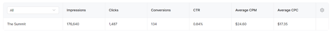
Click the column settings icon in the top-right corner of the table to choose which metrics to display. You can also rearrange the columns by dragging them within the popup.